


 |
||||||||||||||||||||
When ZOOMers Got the FluFlu Survey: flu index | flu facts | school month | map | time line warper | remedies |
||||||||||||||||||||
|
8038 ZOOMers who took part in the ZOOMflu survey got the flu between October and March, but not all of them got it during the same month. What month would you expect to find the highest number of cases of the flu? Or the least? Do you think there will be a trend? If so, what will it look like? Use our Flu got you when? graph to get the answers. 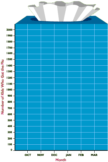
1. Here's how to graph the data. Print this page so that you can draw on the graph. 2. Start by plotting each data point. How many kids reported getting the flu in October? 368, right? Find October on your "Month" line. Hold that spot with your finger or a pencil. From that point, start moving up the "Number of Kids Who Got the Flu" line until you think you are even with 368. Mark that spot with a big dot. That's your first data point. Do this for every month. 3. What do you see? What month did the most ZOOMers have the flu? What month did the least number of ZOOMers have the flu? Why do you think that is? Do you see a pattern? What does it look like? Mark a spot for yourself on the graph. How do you compare to other ZOOMers? |
||||||||||||||||||||
 |
||||||||||||||||||||
 |
  |
|
|
|||||||||||||||||||||||
not yet implemented